
Branding // Logo Design // Case Study
Possum Trot
Project Specifics

As part of the Business Systems - Graphic Design course at Murray State University, I was tasked with creating a restaurant and designing business materials and collateral. At the end of the project, I gathered the design materials and compiled them into a Branding Style Guide. To create the project, I used the Adobe Creative Suite, specifically Adobe Illustrator and Photoshop.
Download the Branding Style Guide [here]
Institution
Murray State University
Year
08/2023
Brand Creation
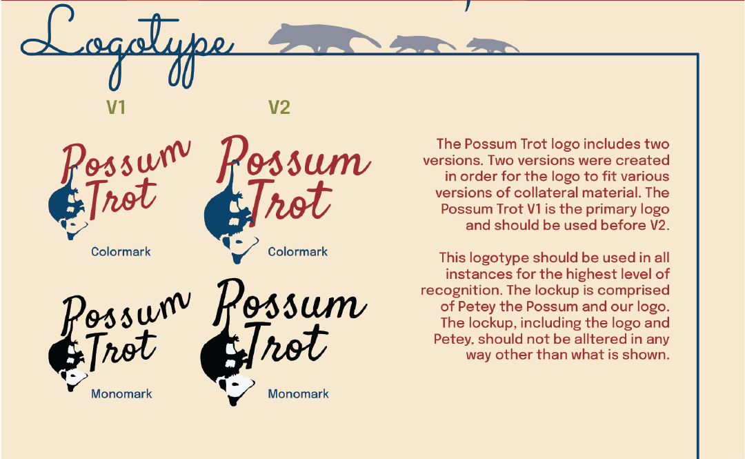
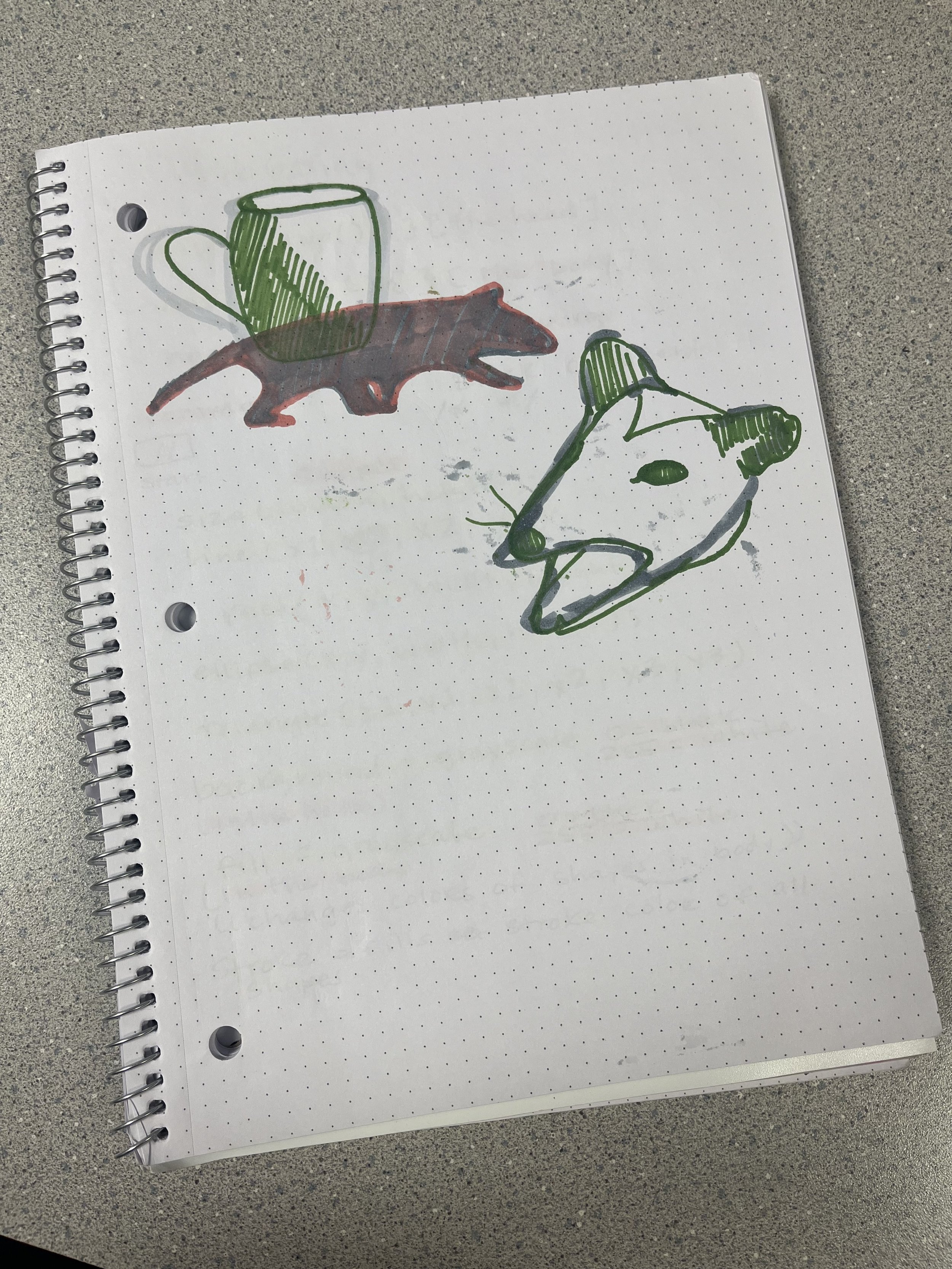
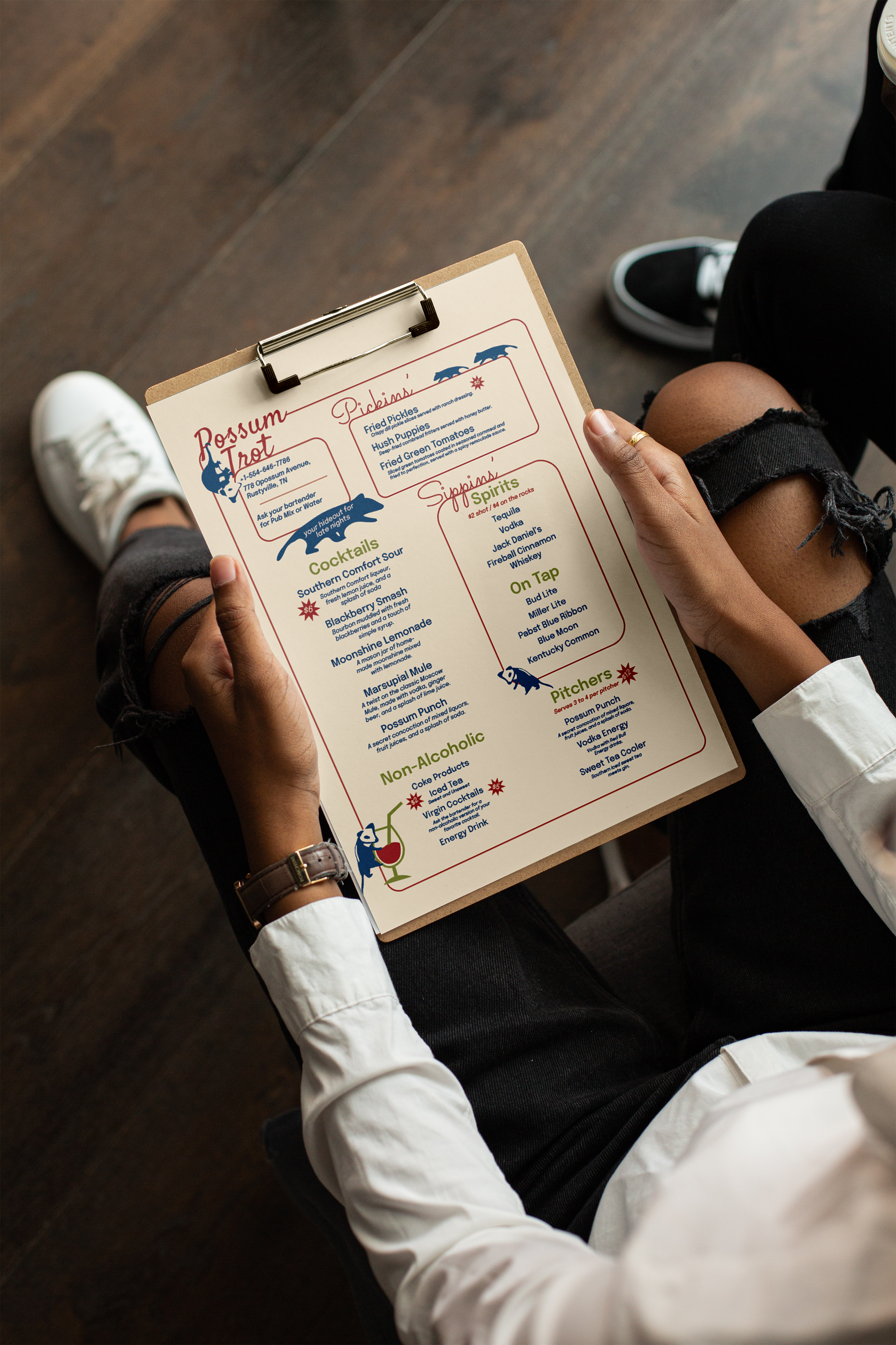
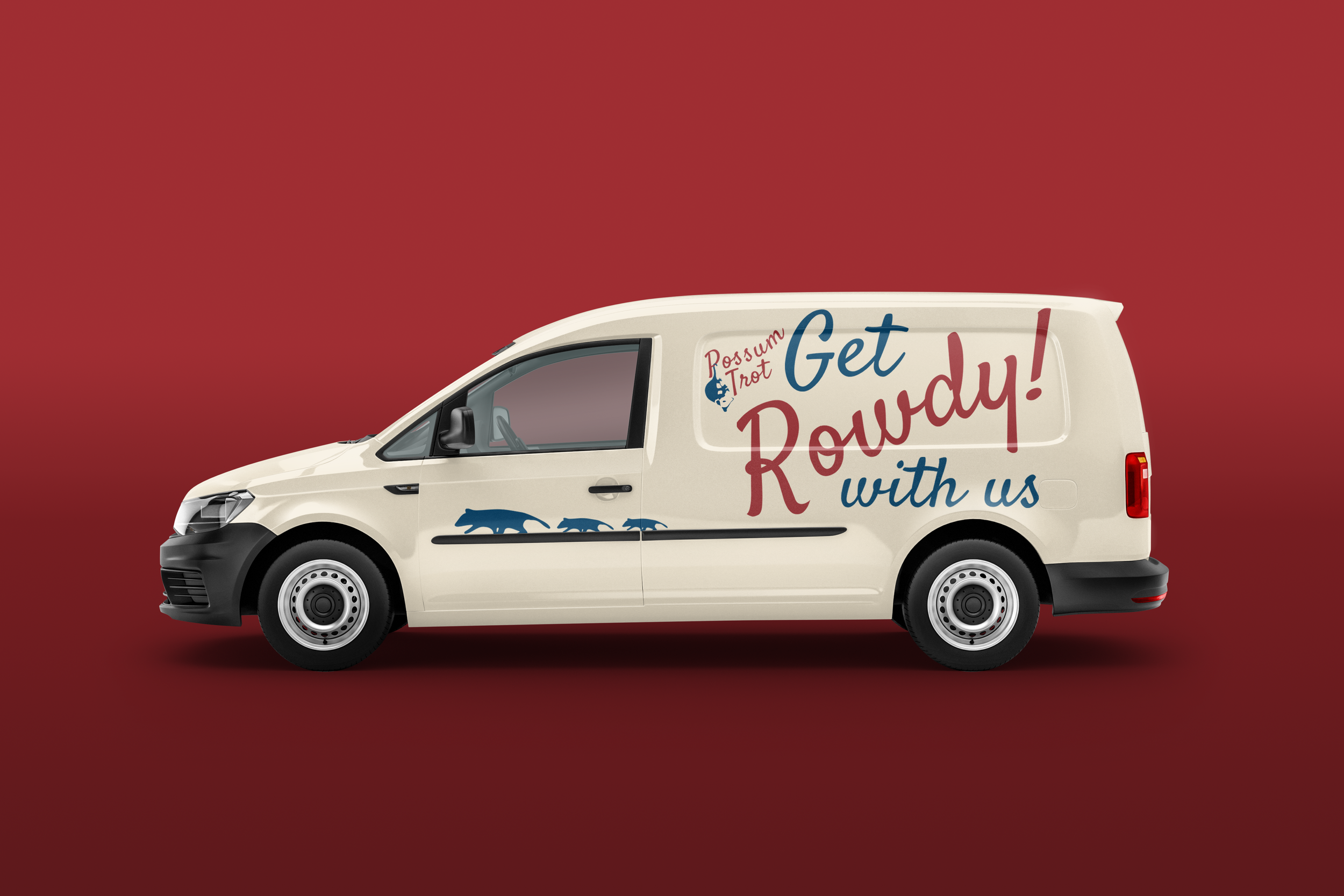
Possum Trot was the bar that I designed for the project. The bar is a mix of a small town environment meeting the low prices and fun drinks of a dive bar. Possum Trot prides itself on its fun atmosphere and I wanted the collateral and marketing materials to reflect that spunk. I wanted an opossum to be the main logo and to be featured throughout the materials as illustrative elements. The design choices were made to be playful to re-enforce the branding, down to the copy on the menu.


Design Process
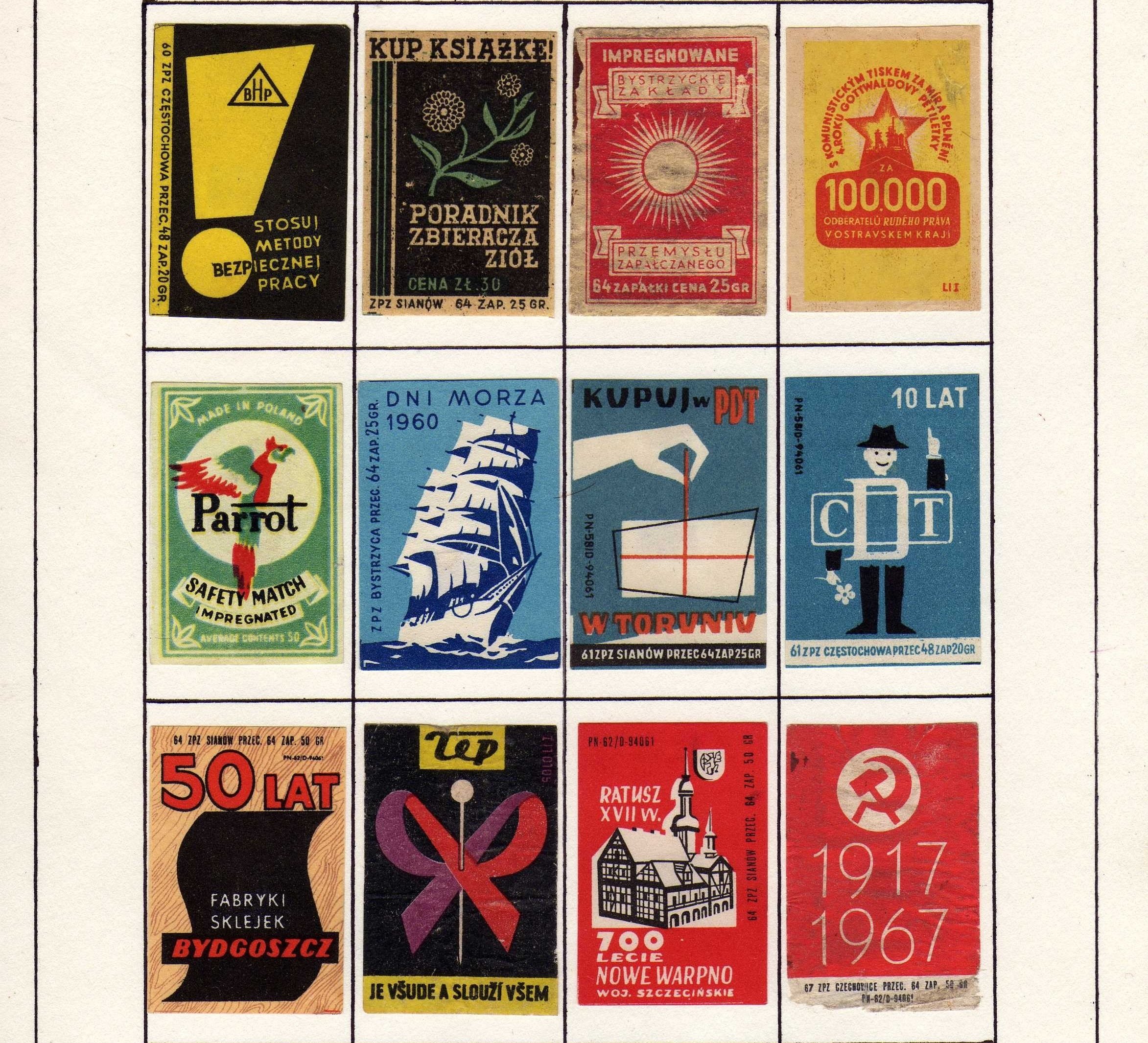
Designing the opossum logo was the most important part in the early design process, as I wanted it to reflect the playfulness of the brand, without being too cartoony. I was initially inspired by 1960s American and Polish matchbook art and how it is used as a form of advertising. I landed on using a simple color palette and more flat styled designs as a call back to the matchbook styles of the 1950s and 1960s. The typefaces I implemented throughout were chosen as they were accessible and easy to read, not too kitschy, but still feeling reminiscent of a vintage postcard or matchbook.


Collateral
Collateral


Style Guide
Style Guide